The purpose of my website is to accurately represent myself in a creative, professional manner. The site will be used to highlight my work, provide insight into my creative style and influences, and make available contact information for potential clients or employers. I would like the design of the site to reflect a sense of fresh inspiration that does not forget classic styling and craft. I believe in the convergence of the old schools and the new, fusing established concepts with modern touches. I will convey this purpose by my color, font, and pattern choices, particularly the use of experimental geometry.
The majority of my site will feature two colors: black and white. I believe this classic combo conveys a sense of elegance. They are serious, yet stylish. The site is wearing a three-piece suit, or perhaps even a tuxedo. This base will set the basic tone of the site. I think black and white is a beautiful combination, and hopefully this will be obvious when those are the most prominent colors on the site. There will be color, however, because the existence of color is what gives black and white its essential qualities. To extend the metaphor, these colored segments will be the tie and the pocket square. Their use is to simultaneously highlight the neutral base and emphasize appealing contrast, but they are used carefully and selectively. Not everyone is as fervent about black and white as I, and I certainly do not want to ostracize myself from a potential client or employer, so making clear the point that I value color will be a pretty important goal for my site.
The font I will use is Century Gothic, a sleek and sans-serif font. I believe it strikes a balance between professionalism and creativity. I do not take myself particularly seriously, but I want to convey that I can do serious work. I think the combination of this font with a more relaxed writing style will mirror that quality. I plan to write in a conversational tone so that my personality comes through clearly. I love to have fun, and I believe connections are made their strongest when two people have a good time together. There is a reason business deals are made on the golf course.
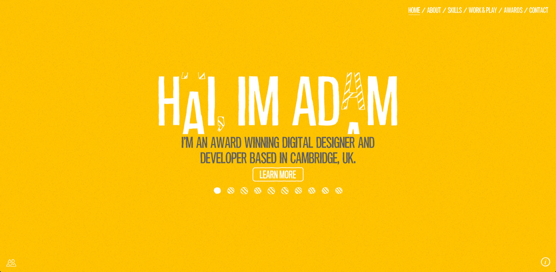
Adam Hartwig, a designer from the United Kingdom, has created a personal portfolio site that inspires me (http://www.adamhartwig.co.uk). While the aesthetic is more wholly playful than I envision my site to be, I really like his language. It is casual, but it is also telling that he knows his craft well. He does not take himself too seriously, but the visitor knows he is seriously skilled. This detail speaks to me resoundingly. The interactivity of his site is beautiful, however that is outside my current ability. I would love to incorporate something like it someday!
The majority of my site will feature two colors: black and white. I believe this classic combo conveys a sense of elegance. They are serious, yet stylish. The site is wearing a three-piece suit, or perhaps even a tuxedo. This base will set the basic tone of the site. I think black and white is a beautiful combination, and hopefully this will be obvious when those are the most prominent colors on the site. There will be color, however, because the existence of color is what gives black and white its essential qualities. To extend the metaphor, these colored segments will be the tie and the pocket square. Their use is to simultaneously highlight the neutral base and emphasize appealing contrast, but they are used carefully and selectively. Not everyone is as fervent about black and white as I, and I certainly do not want to ostracize myself from a potential client or employer, so making clear the point that I value color will be a pretty important goal for my site.
The font I will use is Century Gothic, a sleek and sans-serif font. I believe it strikes a balance between professionalism and creativity. I do not take myself particularly seriously, but I want to convey that I can do serious work. I think the combination of this font with a more relaxed writing style will mirror that quality. I plan to write in a conversational tone so that my personality comes through clearly. I love to have fun, and I believe connections are made their strongest when two people have a good time together. There is a reason business deals are made on the golf course.
Adam Hartwig, a designer from the United Kingdom, has created a personal portfolio site that inspires me (http://www.adamhartwig.co.uk). While the aesthetic is more wholly playful than I envision my site to be, I really like his language. It is casual, but it is also telling that he knows his craft well. He does not take himself too seriously, but the visitor knows he is seriously skilled. This detail speaks to me resoundingly. The interactivity of his site is beautiful, however that is outside my current ability. I would love to incorporate something like it someday!
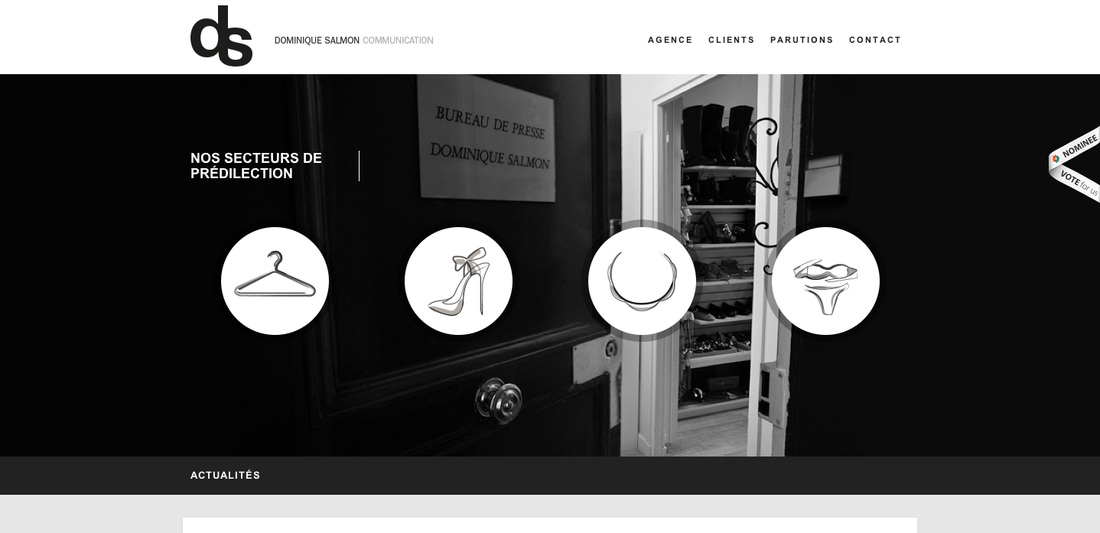
Upon investigation of the web, I stumbled across the site of Dominique Salmon Communication (http://dominiquesalmon.com). I like the way it is structured; there is a good amount of white space up top, a very sharp black and white photo, and overtop that photo is a simple set of circles, each linking to a specific portion of the site. The tone of the site may be too serious for my tastes, but I do like the use of space and tasteful geometrics.
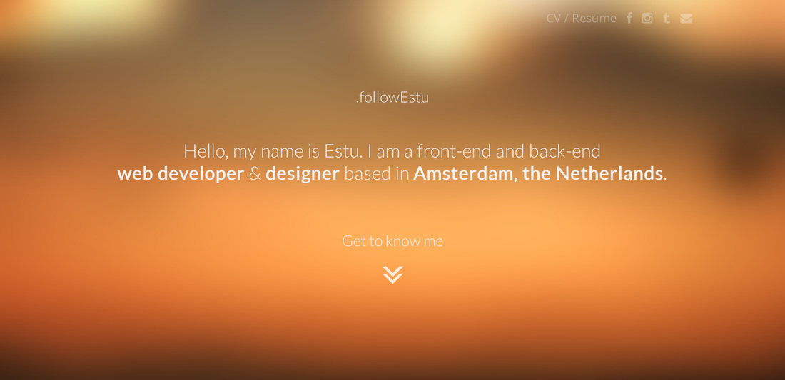
A third site that inspired me is the personal portfolio of designer Etsu (http://followestu.com/). On a technical note he takes advantage of some awesome capabilities of HTML5, and from a design standpoint he makes great use of the horizontal sectioning that is trending amongst web designers. I have completely fallen for this aesthetic, and if I could include it in my own site, especially a static image in the background that can be scrolled past, only to be a different image further down the page, I would be ecstatic. The site is simple and clean, casual, and also professional. Etsu has found a good balance, and that is something I strive to achieve.
References:
Bourn, J. (2010, December 5). Color Meaning: Meaning of The Color White. Bourn Creative. Retrieved October 23, 2013, from http://www.bourncreative.com/meaning-of-the-color-white
Bourn, J. (2010, December 15). Color Meaning: Meaning of The Color Black. Bourn Creative. Retrieved October 23, 2013, from http://www.bourncreative.com/meaning-of-the-color-black
Johnson, J. (2013, September 5). Use Abstract Geometry to Create Stunning Designs. Design Shack. Retrieved October 23, 2013, from http://designshack.net/articles/inspiration/use-abstract-geometry-to-create-stunning-designs/
 RSS Feed